jeudi 31 mars 2011

The Look of the Alps - Part 2

I acquired so many photos of amazing styles I wanted to share with you from the Alps that I couldn’t cover it in just one blog or you would be scrolling down forever!
Here’s the last of the looks I want to share with you, a mix of interiors AND architecture from Val D’Isère.

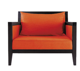
These cushions are just perfect for the après ski look.  I particularly enjoy the local maps of surrounding ski resorts.  Cozy, cute and ski lodge chic, they would be perfect to comfy up a bay window or would be great as fire place cushions to help you warm up after a cold day.


This next piece might not be very different from furniture you would find in the Rockies, but I still love it.  The cow hide top and whittled down timber frame is just the perfect finishing touch next to a fire or used as an impromptu side table next to a comfy chair.


With these next few I would like to show you the different style of architecture that you find in the French Alps versus the North American Rockies.  While similar in some ways, I know you will definitely be able to see the added element of history and European flare.
 
I think my favorite look there had to be the slate and stone roves!  They are STUNNING!  Chiseled away to create beautiful, almost spear like tiles they create a unique look that is used everywhere in the town.


Another charming characteristic of European Alp lodges are the beautiful wood carving influences of the Alsace and Swiss regions with hearts, and curves it always reminds me of a beautiful gingerbread house. 

 If you haven’t seen it yet, I know with the next few you will.  The old, European history really stands out at me.  It adds this beautiful, ungraspable quality that you just can’t replicate in the new building styles of the Rockies.  The swaying foundations, centuries old stone exteriors and there tradition of carving the year they were built takes you back.


Whenever I go traveling I find that most of the pictures I take are of the extraordinary architecture and styles I pass (much to the dismay of my fiancé who would rather have pictures of us).  These different styles that are so different to what I grew up around influence me in ways that surely I’m not even aware of.  An interesting material, an intricate carving or even a new colour will most definitely get stuck in my head and come out in my designs in a way I probably won’t expect.  Be aware of your surroundings.  Take a second to look up and around – even if you’re just walking to work.  You’d be surprised by the beautiful things you’re missing out on.

mercredi 30 mars 2011

The Look of The Alps - Part 1

I believe that the main reason I love design so much is based solely on all of the amazing experiences in travel and exploring I’ve had throughout my life.  When you travel and discover new things it opens your eyes to new styles that you have never encountered before.  Every single one of my travels has definitely influenced my personal style today.  One of these travel experiences was growing up skiing in Park City, Utah - Undoubtedly my second favorite place in the world (the first being my cottage).  The country, ski chalet look has always been a favorite of mine.  I recently went skiing in the French Alps, (a first for me!) and while it has similarities to the Rockie's style, it definitely has it’s own look influenced by Swiss architecture, its VERY long history (we found a building that looked just like many of the new buildings but was from 1759!), and the laid back yet chic French lifestyle. 
Here’s a mix of interior styles that I would like to share with you.

This graphic, which I found on dishes and bedding, has to be my favorite.  The skier jumping, the altitude, temperature and the little Swiss crosses is just PERFECT for a ski lodge.  It is simple, yet different and fun!  A great little addition for your après ski space.


 I found quite a bit of plaid in the forms of curtains, duvets and cushions, and while not atypical of Rocky Mountain style, is still beautiful and compliments that warm and cozy feel you want to create after a cold day on the slopes.


This cushion was probably my favorite find – mainly because it is completely different to anything you would find in North American lodge designs because it is strictly European.  The little Swiss lodge with the crest (something you find fastened to lodge facades everywhere here) is really part of the unique style you find all over the Alps.  There is just so much more history over here.  The history and traditions is what makes it that much different to the Lodge look I grew up with back in Park City.

lundi 14 mars 2011

Shop Profile: Think & More

I came across this shop a couple of weeks ago and have been wanting to share it with you ever since!  They’ve got a collection of some wonderfully interesting yet bizarrely wacky pieces.  Here are a few of them for you to ponder.

As soon as I saw these chairs, I had a very ‘WHAT?’ jaw dropping moment.  These Louis Seize style chairs have been augmented with crazy graffiti!  The designer has taken permanent marker and has…………well…….just gone to it!  There are quite a few of these chairs and they are all completely different.  Wild, but kinda cool.  Definitely not what you would expect at your mother’s for Sunday brunch………well at least not MY mother. 

Ahh remember when the milk man used to come every day with fresh milk in those lovely glass bottles.  I used to get so excited when I heard the clinkety-clink of glass on the milk crate.  Those were the days……….Alright, honestly I don’t remember anything like that as I’m pretty sure the last time that was a reality it was 1956, but I paint quite a picture don’t I ?  One thing that is great from that era though ARE those milk bottles, and a designer at THINK & MORE has created quite the reminiscing light fixture in the image below.  With the ability to choose exactly how many ‘bottles’ and in precisely the formation you want, you can create a very unique light source in your space.


These are probably my favorite find at this shop.  French beret covered stools!  All you need now is a baguette and a cigarette and I’m sure you could apply for French citizenship!  In all honestly no one wears berets here (sorry to dishearten many of you) but it’s true.  I still love it though, and no one says we have to give up our sweet little French reveries.


mercredi 9 mars 2011

Designer Profile: Pols Potten

This design shop is quickly becoming my go to option for wacky, awesome design objects.  POLS POTTEN from Amsterdam is overflowing with super cool and interesting treasures just waiting to be found.  Here are a few of my favourites.

This is a piece of art…..yet it’s a candelabra!  A sculpture of coral with holes in the top for a beautiful, candle lit centrepiece for your table - Innovative, and eye-catching!
A very cool and sophisticated addition to any dining room (it would also look great in your living room on a coffee or side table or mantle!)


Ok, so by now we all know my obsession with making old designs new.  This is a spitting image of that whole concept – J’ADORE.
A Louis XV inspired chair entirely sprayed in bright, funky colours!  A great way to go modern while keeping traditional elements.


This oversized light fixture is spectacular.  It has the look of a large bell cloche but is given the dramatic texture of large fish scales.  I just LOVE this.  It is gorgeous and striking and while it is very contemporary, could fit very well in a myriad of different styled rooms.


Element of fun? CHECK!  Haven’t fulfilled your fix of random for a room?  Why not try a watering can headed dog….teapot!  It will definitely reach your…..WhAt?? quota!
I love crazy fun items like these.  It follows along with that fill your room with random porcelain animals trend (which I think was started by MOOOI but who really can tell these days).  So if you are one of those people that has to have the newest trend to show off to all your friends – this will definitely one-up them.


I have to say scouting out designers and familiarizing myself with their new collections is really a lot of fun.  I always say that ‘I’m working’ – but really I’m just at play!  Hope you’re enjoying this romp around Paris as much as I am!

lundi 7 mars 2011

Designer Profile: Jardin Pamplemousse

The design company JARDIN PAMPLEMOUSSE produces beautiful collections with unexpected bright colours and shapes characteristic of the 60’s and 70’s.  It is a beautiful blend that creates a surprisingly elegant finish.  Here are a few pieces and images that will give you a very good idea of their production.
 
This stunning study set is a favourite of mine (actually quite a few of this series are favourites).  The curved edges of the desk are a definite reminiscence of the 1960’s era, and the bright colours mix hippy style with the opposite elegant formality of the time. 

This deep lounge chair is a beautiful combination of retro and modern.  The bright orange with the straight clean lines harkens me back to the time of smoking rooms.  I can almost see Don Draper lighting up in a crisp suit while reclining on this piece.  Genius always comes to mind when I see a piece that has blended old and new into a flawlessly executed design.

This set definitely leans closer to the contemporary side of the scale, but the curves of the desk and the stark contrast of colours undeniably evokes the characteristics of the MOD period.


I’ve added the two showroom images below just to highlight the beauty of their creations.

vendredi 4 mars 2011

Mad Hatter Designs


Did you ever wonder what living in a Disney cartoon would be like?  Well, wonder no longer as I have the answer for you.  KARE has come up with a collection that would make you believe you are Alice herself wandering through a dream wonderland.  I really could go on and on and on about this company because they have so many interesting and wild collections that are just ridiculously fun.  Here are a few pieces from their ‘Wonderland’ line.

This wacky and bright chest of drawers takes an old style commode (perhaps Victorian) and has distorted the lines to accentuate the curves, livened up the finish and creates a piece that I would definitely believe comes from that crazy dream world.  Don’t you just love the addition fluorescent woodland animals?  


This cabinet looks almost typical (if you can ignore the bright violet colour), but when you open it, you know for sure you are no longer in the land of the drab and unexciting because you are hit with an abundance of the brightest lime green interior!  (The purple pig helps too).


Mad Hatter Tea Party Chair
This is not actually an abnormal design these dates.  There are many oversized wingchairs in current collections.  It is the colour that makes this piece so extraordinary.  You can almost see the tea party going on! 


The inspiration for this chair is mighty clear.  The Queen of Hearts is one strong, interesting character, and it comes through in the shape and colour of this chair.  Wild it may be, but intriguing none the less.

This little chest of side drawers actually makes me think it really was designed for the Disney bedroom line.  It looks like a cartoon!  The curvy, warped lines, the fluorescent colour, and its overall presence makes me hope the majority of owners of this piece are 8 years old.


I have to be honest, Wonderland always freaked me out as a kid, and it still does today.  Something about the playing card soldiers, and the dope smoking caterpillar – it’s just WEIRD right?  I don’t know how realistic this line is, you would have to be a certain type of person to enjoy this in your home.  But it’s fun to look at and if you love the dreamy storyline maybe it’s for you.

mardi 1 mars 2011

Le Recyclage: Part Deux


I’ve said it once, and I’ll say it again, the salvaged look of recycled objects is always a great addition to a space.  It adds an authentic dimension.  Here are a few more options to get this look.

The two tables below by OFICINA A LAPA are perfect examples of using bits of something old to make something used.  Remnants of aged pieces of wood have been remodelled together to create wonderfully striking designs.  The random images on some of the pieces add that little bit of extra interest.  A different and unique addition such as these would create a strong central focus for any space. 


The chair below by PO PARIS is an adaptation of Arne Jacobsen’s Egg Chair.  It’s not as large as the original design but is equally extraordinary.  Old bits of barrel steel have been fashioned to create the chair’s shape.  The external barrel colour and flecks of old paint are what produce the antique feel, yet with the contemporary Egg Chair design it is the perfect blend of old vs. new.


Also by PO PARIS below is an old barrel that has been adapted to create an exceptional side table with extra storage space (something we all need).  With a new coat of paint, it looks as good as new.
A piece like this will add not only the necessary requirement of a table and storage, but also an element of interest and fun. 

With pieces like these, you will always have an amusing element of surprise in your home.  It’s always best to keep a space light-hearted and young rather than worn out and dreary isn’t it?