vendredi 28 janvier 2011

Ancestral Accessories

This is a subject I have wanted to write about for a while.  So when I kept coming across booths with these ‘special’ items at Maison Objet, I thought it was about time that I attack it.
The use of Tudor to Victorian style portraits as accessories in the contemporary home.  I’m not talking about people buying a portrait from an antique dealer and hanging it on their wall  -  But actually placing the image of Tudor/Victorian portraits on cushions, trays, wallpaper etc. etc. etc.!
It is everywhere here and I’m still trying to wrap my head around it.
It’s not that I’m criticizing it at all – in fact I find it somewhat fascinating. 

These cushions are from Vox Populi.  The faces of these Victorian women are creepy and amazing and I think they are…..a little hilarious.  Some may disagree with me, but I think they would add some sort of whimsical humour to a space.  They are serious women that are supposed to be appreciated as a serious Victorian portrait, and instead their face has been stuck on a pillow!  Yes, quite hilarious.


In some cases these accessory portraits have undertaken the odd replacement of humans for animals dressed as Tudor figures.  Perhaps this is a certain take on the Tudors obsession for animal symbolism in their paintings but who really knows?  I must say thought that I find these ‘oh so fun’!  There is something, woodsy and ethereal about them.  They would be great in a library or study if you want to keep up their mock formality, but really they would look great in any space!  Especially where the main colours are light neutrals so they will stand out and grab your attention!
The design company, IBRDE makes a number of objects with images like these including trays and wall hangings. 

 These designs are quite ‘weird’, but will definitely add interest and intrigue to a space.  Everyone likes a conversation starter!

jeudi 27 janvier 2011

The Written Word


The writings on the wall
There is something beautiful about having special lines of poetry and favourite words stuck up on your wall for all your visitors to see.  You know magnetic poetry?  Same idea, but bigger and better.  The wall covering designer, Tracy Kendall, has really made a name for herself plastering larger than life decals on her clients’ walls, and more recently sticking a whole bunch of words up there too!
The two wallpapers below were featured at Maison Objet and I just LOVE them - Especially the black and white creation (below, left) that has a 3D element to it.  Sure we could just put up woven grass wallpaper to add texture to our walls, but this is taking it to a whole other level!
 The paper on the right I find produces such a beautiful old worldly feel yet is contemporized with the bright orange font colour.  The script is lovely imagery and even though busy, has a calming sense to it.
 These are different and innovative and will give your guests something to read while you’re mixing drinks! 


 Ok we’ve all seen mass produced canvas pictures, tables etc. with names of cities all over it.  There is something about this chair (From Now's HomeleBrun) though, that grabbed me.  The size, the shape and contours – there is something regal about it.  The contrast of the black and white really got my attention.  I think it could be very interesting as a pair opposite a sofa in a sitting room.
It would certainly reach your quota of ‘loud’ for your room.
 Note: Fabrics in white with black cursive writing on it are NOT so loud.  The contrast is not so stark and it allows for a more gentle imagery.  Where all caps letters are bold, flowing cursive lower case letters are not. 


 Stating the obvious – Is it really so bad?
I noticed quite a few pieces that had the object’s name emblazoned on them.  For instance a plastic chair had the word ‘chaise’ plastered all over it.  
Here is another option.  A little white table lamp from Exnovo with ‘light’ printed all over the shade.
Cute?  Yes.    Busy?  Quite.   


To have items like these in your home, you need to be a person who doesn’t get bogged down by brain pollution when you ingest too much media and graphics.  Negative elements aside, I still think it adds something very unique to a space.  But do be careful, too much will make the room loud and crazy.  You must always appreciate the delicate balance of too little or too much.  In other words, don’t reach your word limit!

Everything Maison Objet!!

If you haven't heard Maison Objet just passed through our little town of Paris.  Maison Objet is a HUGE, annual interior design show where the best and brightest from all over Europe (and a few from Asia as well!) exhibit their collections.
So stay tuned, I'm going to be churning out blogs like never before - there is so much to show you!
Get excited - I know I am!

jeudi 9 décembre 2010

Child's Play


After another one of my wanders through Paris the other day, I looked through my pictures and noticed that the vast majority of them were silly, witty and fun.  A virtual time travel to a child’s playroom.  If Paris is one of the design capitals of the world, does that mean that back home we take interior design too seriously?  Things can be so stiff and perfect in North American design, maybe we should go back to basics.  Just a thought.  Here are a few ideas to do just that.


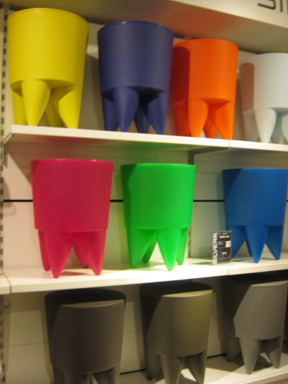
These STARCK stools remind me of building blocks.  Amazing, crazy coloured building blocks mind you but still in the realm of a child’s play thing.  I think I’m drawn to the versatility of them.  They can be single, stacked, can be the base for a table, an ottoman etc etc etc.  All while adding something wild, colourful and different to a space. 


These hollow boxes with playing children cut out of them threw me for a double take.  Are they for a child’s room, are they not?   And then I started thinking there’s not too many people who would shell out for LIGNE ROSET as an addition to their child’s play space.  What I love about them is they can be built up to create a shelf/storage area.  They would definitely add some juvenile fun to a room.  

 
When I found these at DOM (by Christian Koban), I literally started jumping up and down.  The idea of building your own furniture out of LEGO was a bit too much awesome for me to handle.
The pieces come just like the LEGO sets you had as a kid – bright colours, different shapes and sizes – yet lifesize!  Pink LEGO chair anyone?


 I think what is striking me the most in Paris is that people are so OPEN to fun, crazy, and different interiors.  They WANT that element of loco to add to their space.  It is a necessity.  J’adore.

jeudi 2 décembre 2010

Les Coussins

When you are searching for accessories, what do you look for?  Something that will just go with your sofa or wall colour?  Or maybe also something that is exciting, new and a great design?   When I look for an accessory such as cushions, I don’t just look for something that is functional or that’s just the ‘right colour’.  Accessories FINISH a room.  They are not just something you throw into it.  Accessories give the room life and personality.  They make a room lived in.  Accessories are where you can add the fun be it through a great texture, crazy print, or beautiful bright accent colour.  Here are a few ideas I have come across while in Paris.

This Jean Paul Gaultier for Roche Bobois creation might just be my favourite.  It is a corset on a cushion!  Quintessential french burlesque style.  It is SO much fun and to me just screams Paris

A little Moulin Rouge anyone?


These two are my own designs, made for our apartment in Paris to give it some life and colour.  I just popped in a fabric store and picked out some great fabrics that could work together and made some patchwork cushions!  Then on a visit home, I scrounged through my mothers sewing box searching for old bits of ribbon and a massive box of those extra buttons from clothes that no one ever ends up using.  To me they are fun and chic, and different to anything I have ever seen in a store.


Texture, Texture, Texture.  One of the number one design theory rules is to avoid a flat design, you must use different textures within a space.  You will never have depth, or character in your room without it.  With this cushion, (found at FLEUX) I don’t think you could add more texture if you tried!  (It’s quite comfy too!)


And now for a little bit of wild – this print just grabbed me right away (Also at FLEUX).  I think it’s because I am very into random objects, prints and colours being thrown together right now.  There’s just something very…………perfect about it.  It adds interest, fun and DIFFERENCE!  I have to say I am very sick of seeing the same room being designed over and over again.  You know the one I’m talking about.  The one in the magazine with the beige couches, and a cushion in either dark blue, or aubergine with a silver lamp and cream walls……ring any bells??


I’m not preaching that we should all have crazy fabrics with skulls and nutso prints on them - Because that is definitely not for everyone.  I’m saying that to give your room life, to make it look different from all those rooms in the most recent magazine – you need to maybe step towards the unknown.  Not something you’re uncomfortable with, but maybe that item that grabs your eye in your local design store every time you walk in, but you leave without it because you think maybe it’s not you.  Why not bring it home next time and try it on for size?  You may be surprised!

lundi 29 novembre 2010

Tricks of the Trade


This is somewhat of a departure from my usual blogs.  I would like to take the opportunity to point out what design traps not to fall into and to show you that to change and improve the look and feel of a room, you often don’t have to do much!

I went to an AMAZING restaurant last week for my anniversary in Porte Maillot.  The food was beyond perfect, wine unbelievable, and service and chef attentive.  The only thing that bothered me was the décor!
(Apologies for the poor quality of the photos, they were taken quite quickly on my Iphone)


The chairs were beautiful, comfortable and probably cost a small fortune, the curtain sheers worked lovely with the chairs, the curtain poles and finials added a different layer with their shiny chrome finish and cost I would think upwards of 500 euros each.
The thing that DID affect my appreciation of this expensively decorated room was the colour of the wood work.  It was that horrible dark honey coloured wood that you see in cheap condominium kitchen cabinets and was used CONSTANTLY in the 80’s and up to the mid 90’s.
The wood on the chairs is a lovely mahogany coloured stain, the curtains have flecks of the SAME dark brown, so why oh why would they not sand and re-stain all of the wood work in that colour as well!  It would TRANSFORM the room. Take it from in my opinion a disjointed ill-flowing space into a chic, modern and elegant dining room.

The only thing that I could possibly think of is whoever was making the decision may have thought it would be TOO dark.  Of course that would not be the case with the light colour of the wallpaper and curtains.  However; I have come across this MANY times with clients.  They are too scared to create either too dark or too light a space.  And many times the reason is because “Oh well if I use that red or dark brown, my room won’t look right in the summer”.  If you have that mindset, you might as well just use beige throughout your entire house and be done with it.
Yes certain colours and shades are related to the seasons.   Reds and browns are great for a cold room in winter because it warms it up.  Lavender and blue is perfect for a room in the summer because it cools it down.  But, you just can’t be so white and black about colours like that or you would be painting your room a different colour every season!  If you are VERY concerned about this “colour problem” let me assure you – it is so easy to transform a room with the seasons simply by changing window treatments, accessories, cushions and throws - All things that do not have to be expensive and that you can store away.  For example, if you wanted a cozy red room in the winter, all you would have to do to make your room summery is to take down your heavy winter curtains and replace them with flowy, cotton sheers.  You could also put some light linen throws and cushions on your sofas.  Add lots of white and cream in your accessories with candles and flowers and voila!  Not hard and it doesn’t have to be expensive (hint – IKEA has great cheap white and cream cotton sheers).  As long as you’re creative you don’t have to be SO restrained by this never ending question of colour.  Redoing a room can be expensive, so if you’re going to do it, DO IT RIGHT!  Don’t be scared by the unknown, let yourself go and don’t be restrained by these “RULES” I hear so much about.  Yes as I designer there are rules in terms of design theory, but these other colour  “RULES” are just hogwash!  Probably a rumour started by the woman on your street WHO’S HOUSE IS BEIGE!

jeudi 25 novembre 2010

Illumination à la française

Sick of sifting through the endless aisles of brass, tacky faux finishes and cheap ‘crystal’ chandeliers at your local lighting store?  In Europe, innovative lighting options are MAINSTREAM.  There are endless ideas to illuminate your space in the most innovative and daring ways.  Here are a few ideas:

These two lights from Roche Bobois grabbed my attention because of what they were made of. 
This table lamp’s shade was sculpted into the form of a male torso and is made not from a hard metal but is actually a malleable vinyl!  Showing that it doesn’t only have to be the shape of a design that can grab your interest but it can also be the use of an unexpected material. 

The floor lamp above was also made using the same vinyl and was constructed in a way that reminds me of oriental lanterns stacked atop one another.  In my opinion; a very beautiful departure from the typical, boring floor lamp. 


 This adjustable floor lamp by the French company CINNA is some what of a technical design fascination for me.  It is covered in a moveable, flimsy netting.  Do you remember those tubes you used to play with as a kid where you could trap your finger in it and no matter how hard you pulled you wouldn’t be able to release your finger unless you released the tension? (Actually I think parents use them now to keep their kids in tow!)  The base and arm of the lamp are sheathed in it and you can actually move the sheath around the lamp creating different lumps and shapes. 
I have to admit I stood their playing with it for five minutes before I even checked who the designer was.  (I think the sales lady thought I was a bit of a looneytune)
A great reading lamp and finished again with a very unexpected material.

These are not just ways to illuminate a space but are also an innovative addition to your design scheme.  For my readers back home, take your time when trying to find lights for your space.  Don’t just get fed up and trek over to IKEA.  Look for a light that can provide the dual purpose of illumination and beauty of design.  You won’t be disappointed.